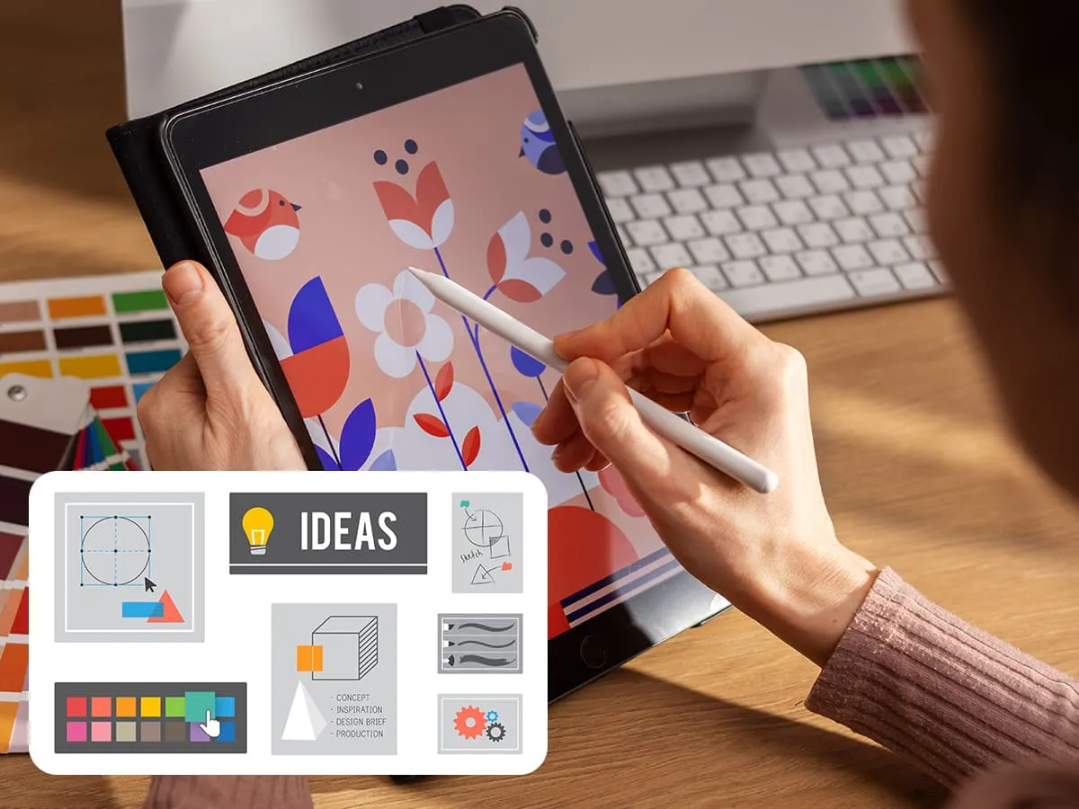
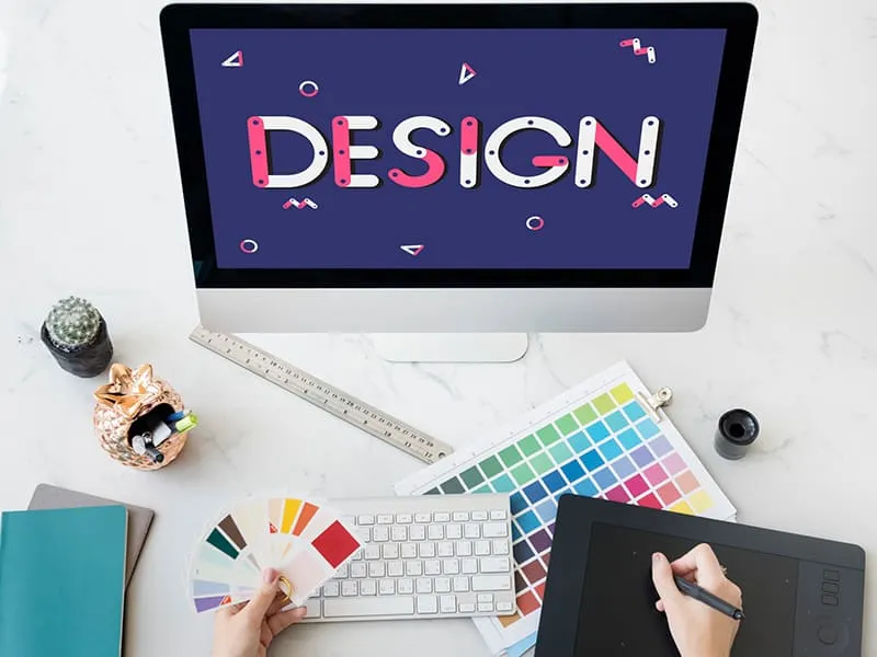
As an art lover, you have decided to grow your profession in the field of graphic designing. Well, great decision! Now, you are in the process of considering how to start yourself in this creative and awesome field.
After a few cautious judgments, you come up with a decision to enroll yourself in a design skills course. But before you hit a button, take a beat and gather some thoughts of what you need to first learn before you jump on it.
Let us acknowledge you, prior you registered yourself in any graphic designing course, learning certain elements of design to make your designing skill course as simple as breathing.
Electrify yourself to explore the 15 elements of design that can be a first step in your graphic designing career path.
Let’s begin the journey!
Table of Contents
What Are the Elements of Design?
The elements of designs are the basics of any visual design. These graphic designing elements includes colors, shape, line, texture, form, size, value, typography, contrast, rhythms, emphases, unity, balance and proportions.
As a graphic design enthusiast, you will use these elements to create a static image or motion image or any animations that portray a certain humor, mood or a feeling and attract the human eye at a certain level.
These elements of designs also used interchangeably with “design principles” which are set of practices or rule one must obey to it to come up an attractive and effective design composition.
15 Different Elements of Design
The 15 elements of design are the backbone of any artwork that work cohesively to create impressive visuals that evoke emotion and convey meaning, from graphic design to architecture and beyond. Let’s overview each of them in detail:
Line
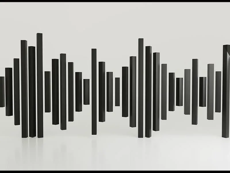
The line is the visual route through a design. A real design takes place only when there is distance between two points by providing structure and movement to it—lines do that all. Lines can be dynamic or static. Dynamic lines are energetic and appeal to the eye while static lines are stable and give a feeling of strength to the viewers.
Lines gives alignment to a composition to frame and divide visual representation. When applied artfully, lines add grace to the composition and to add hierarchy and to appeals the eyes to a certain point. A line can take a form in more than a single stroke, it can be creating with numerous single strokes and even dots.
In a vertical floral arrangement, static lines are highlighted to create a sense of strength and stability. Tall flowers such as delphiniums or gladiolus form strong, upright lines that provide a feeling of balance and structure. These lines make the design feel grounded and eternal, giving a calming visual experience for the viewer.
In a cascading floral arrangement, dynamic lines guide the viewer’s eye downward in a flowing motion. Stems of flowers like trailing greenery or orchids such as ivy are strategically put to create energy and movement.
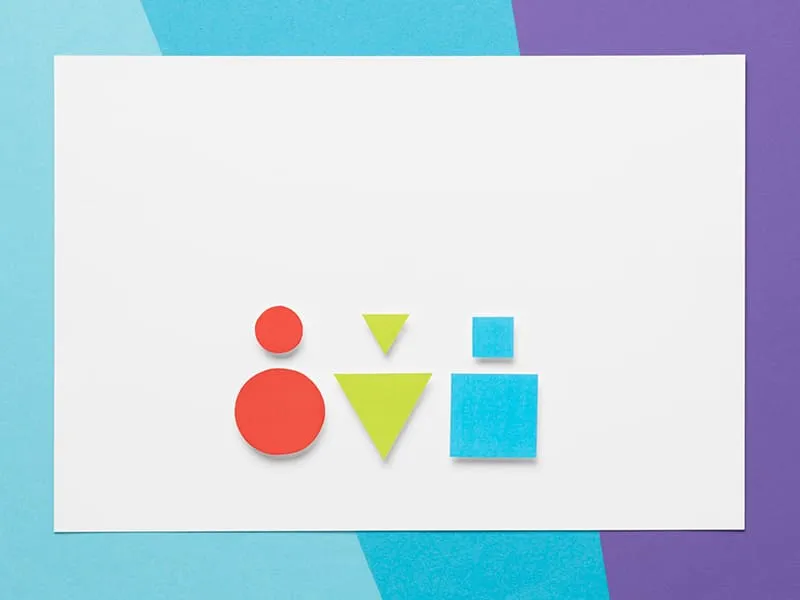
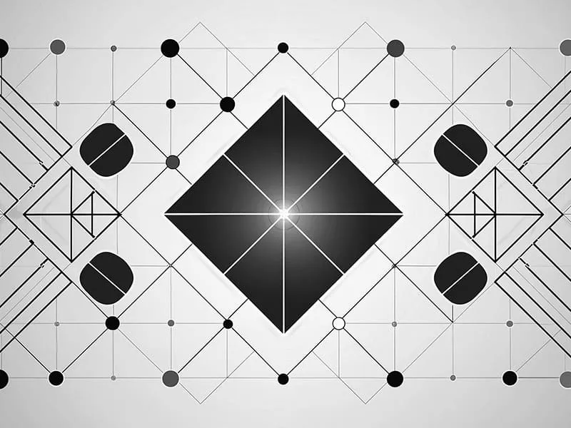
Shape
Any tangible object (or even living thing) we look at has shape, no matter how crooked it appears but it has a shape. Even, when we dig deeper we see that all elements of design have shapes somehow. Since every visible matter has a shape, the total quality of possible shapes and their interpretation is never-ending. That is why, it is sensible to sort shapes into certain categories which can even sometimes overlap.
Simple vs Compound: Simple shapes are also called “primitives” are the basic geometric forms such as circles, squares, triangle, rectangle, cone, polygons, trapezium, hexagons, quadrilateral, parallelogram, hexagons and sphere.
On the other hand, compound shapes are big and intricate shapes made up of basic shapes put together such as heart shape and crescent moon.
Organic vs Inorganic: You see nature like a greenery or rolling hilltop. All these contain curvier and looser lines while inorganic shapes are highly symmetrical, rocky, rigid and doesn’t come from living beings—are tends to remind of man0made things like machines and buildings.
Abstract vs. non-abstract: Abstract shapes are used as symbolic or figurative references and mostly have compound and geometric shapes that depict ideas, feelings, or qualities. You see abstraction in the form of the Jagged edges, sharp angles, or textured surfaces creating contrast or a wavy lines and layered shapes giving the impression of motion.
Non-abstract shapes are related to objects or particular examples, and not ideas, feelings or qualities. Such shapes can be organic, geometric, natural and human-made.
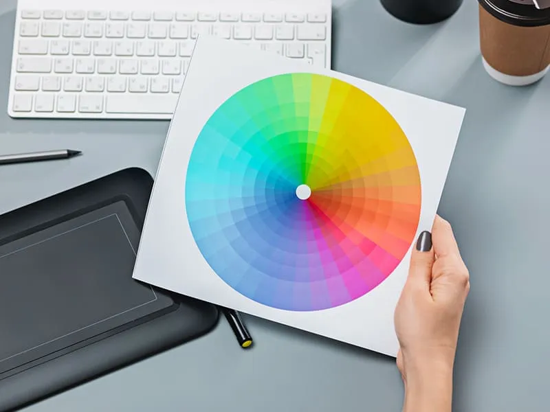
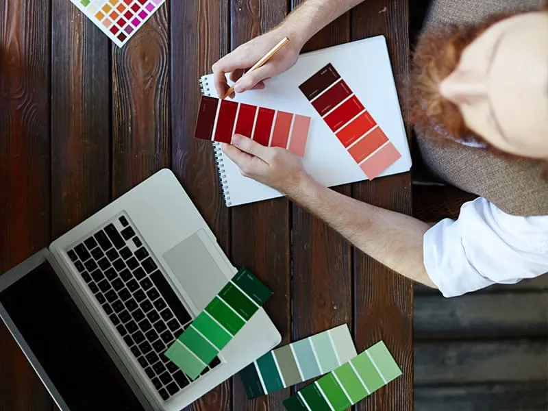
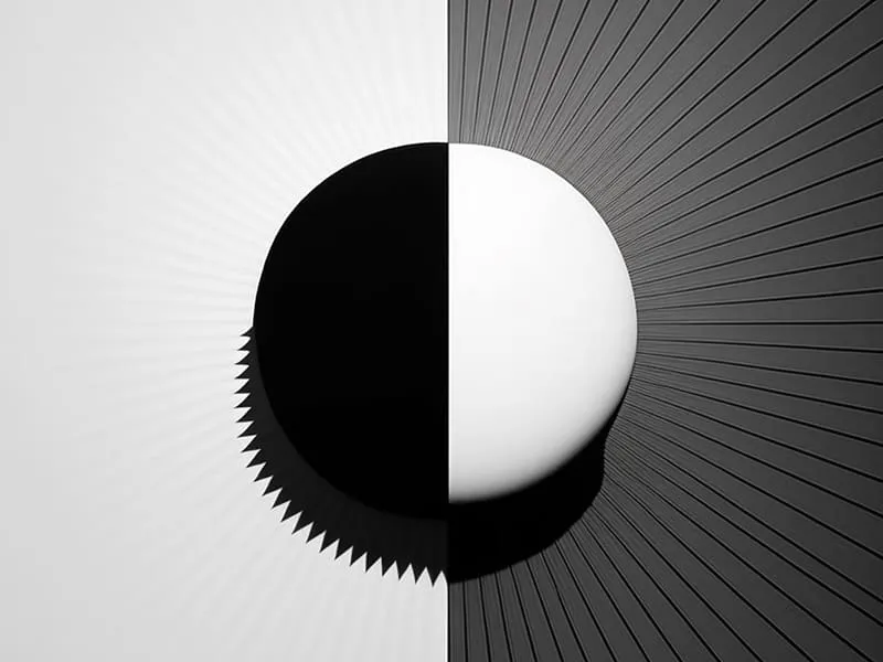
Color
Color is a perception. When we see something (or we called it an “object” in design) such as water or a ground or sky, a transfer of data between brain and eyes occurs which conveys us it is a particular color. The object we see reflect light in multiple wavelengths. Our brains pick up those wavelengths and convert them onto phenomena called color.
Colors came to life after the mixture of hue, lightness, and saturation and aroused feelings, set tempers, and made a visual hierarchy. In color theory, a color wheel has been built that arranges the colors and grouped them into 3 segments:
Primary colors (red, yellow, blue, or RGB), secondary colors created with a mixture of primary colors (green, orange, purple) and tertiary colors occurs after the mixture of primary and secondary colors such as red-violent and blue-green.
Two Primary coloring model called additive color model RGB (or Red, Green, Blue) occur after the fusion of different intensities of red, green and blue and subtractive color model CYMK or (Cyan, Magenta, Yellow and sometimes Black, forming CMYK) happens by subtracting (absorbing) light from white light using pigments or filters.
Value
Value is an object’s lightness and darkness in a document or composition. Any modification I the object darkness and lightness develops a value shifts. This move can also happen in color because any color can be exploited to be lighter or darker. Take an example, how color pink has a lighter version and a darker version and how a hunter green is a darker shade of green.
Value can plan gig character in the color saturation level but one should not be confused with the other. When you use “value” in design, you can develop readability, volume, and mass, light/dark contrast, and form illusion and comparison and contrast.
For instance, best practices for content marketing recommends using VSL (Video Sales Letter) for intros, tutorials or product demos. This is because visual content tends to be more engaging and easier to understand.
Texture
The texture is the surface quality in an artwork found in both 3D and 2D designs created with the recurrence of the line and shape. Simply, it is any design visual tone—, rough, smooth, fuzzy, slimy, and lots of other textures something in between.
In general, there are two types of textures physical and visual. The physical texture also called tangible texture or actual texture is a variation that exists on a solid surface—unlink visual texture it has a physical form that you can feel and touch. As an example, when you touch any rough surface you feel energetic while a smooth surface gives you a relaxing feel.
Visual texture or implied texture is the illusion of having physical texture, even though it is digital or visual. Before you create a visual composition of an object, you add texture to it. Visual texture is most often applied in photographs, paintings, and drawings by designers to showcase their own work of art realistically and with justification.
Other textures are decorative textures used to give embellishment or decoration to a surface altering the surface structure makes the design highly fancy. Another is the spontaneous texture which goes beyond creativity as it can occur by a coincidence through random shapes or marks giving a more refined look.
Another texture that receives a lot of attention is the mechanical texture that came to life using technology and machines. As an example, through grainy patterns, photography or printing creates a texture that we see in digital designs, typography, or computer graphics.
One more texture that is highly prominent within in graphics design realm is the Hyper texture which is a highly detailed, realistic texture produced by small distortions on the object’s surface. It is mostly existing in digital art or 3D graphics to make surfaces appear lifelike.
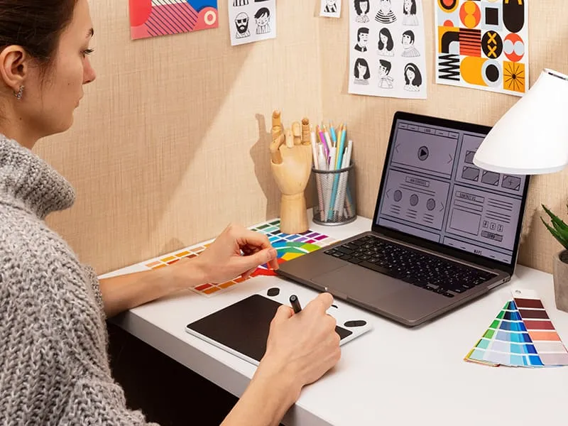
Space
Space is an area (or areas) around, between, and within design elements. The clever use of space creates proper visual hierarchy and balance. One should be careful when deciding where to place the elements keep in mind the relationship between the elements of design to come up with beautiful, memorable, and unique compositions that can successfully communicate the intended message. In graphic design, space comes in multiple forms each has its own functionality and purpose as follows:
Positive space: Elements such as objects, figures, shapes, colors, images, and texts are occupied by the subject or a main focus or primary element of the artwork refers to the positive space. As an example, a circle has a black outline and white inside on a white background where a black outline is the positive space.
Negative space: The space around and between objects, figures, shapes, colors, images ad texts, or other elements of design refers to the negative space.
Active space: The space that draws attention to the viewer or highlights basic design elements. Active space can be both positive and negative. You can craft active space through the use of, contrast, color, movement, and organic shapes.
Passive space: The space that exists naturally between lines, letters, and paragraphs in a text is passive space. Such spaces are subtler and balance the design. Compressing or stretching your passive space can be just as powerful as performing with the other space types — so never undervalue it!
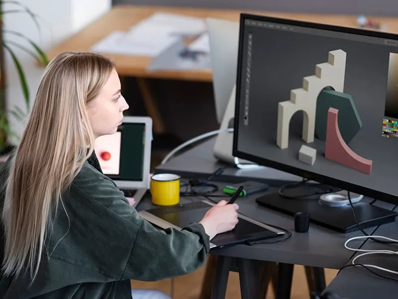
Form
Form is any 2D or 3D object in the graphic design realm that is measured by the width, height, and depth or only length and width. Form can be generated or illustrated and can be described as object shadows on surfaces that can be round, flat, or pointy.
Forms add realism and depth to the entire design that appeals to the naked eye and can be improved by color and texture.
Most forms are 3D and aim to arouse the sensation of roughness, smoothness, softness, and rigidness.
In the world of graphic design, forms exist in two types:
Organic and Geometric. Organic forms appear to be natural whether simple or complex while geometric forms appear to be manmade provide a feeling of order or control or appear sterile and clean.
Organic —Wavy, irregular shapes often in abstract art, or fluid animations.
Organic —Leaves, flowers, and plants in nature-inspired illustrations or logos for eco-friendly brands or wellness companies.
Organic —Clouds or water droplets seen in weather app icons or natural scene renderings.
Organic —Abstract natural shapes such as wood grain, mimicking rocks, or tree bark in a design.
Organic —Animals or human figures in mascot logos or expressive character designs.
Geometric —Grid systems that provide structure in layouts and web design.
Geometric —Circular forms in company logos (e.g., Coca-Cola or Pepsi) or as part of user interface design.
Geometric —Spheres, cubes, cones, and pyramids often in 3D modeling or logo designs for IT companies.
Geometric —Straight-edged polygons (triangles, squares, hexagons) in corporate branding.
Size
Size is simply how small or big the element is in comparison to other design elements. In general, graphic design uses size to make specific elements noticeable in comparison to others. Size carries prominence, hierarchy, and visual influence.
In any illustration, brand names or titles appear to be larger than other design elements to showcase the hierarchy. In the context of proportion, size relationship matters a lot i.e. small icon next to the huge image or text creates intentional contrast or visual harmony. Similarly, for campaign landing page designs, CTA buttons are visually big to put emphasis allowing the viewers to right away click on it.
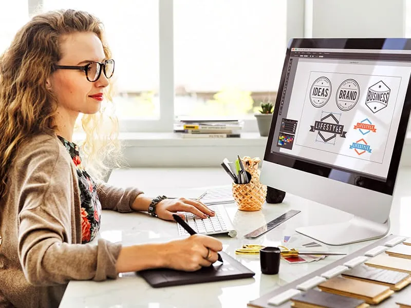
Typography
The artistic practice of using typefaces and fonts or the design, and selection of letterforms to be arranged rightfully is called typography. The core purpose of using typography in a design is to make the viewer’s text readable or evenly spaced. Remember, the true creativity of typography lies in its talent to modify how a viewer feels about a message you wish to convey.
When we talk about typography the two factors are of utmost importance: fonts and typefaces—although both are used interchangeably but have historical differences.
A typeface is a design of particular letters such as Calibri, or Times New Roman while fonts are the variations of these different typefaces such as for Calibri, is 32pt size, bold and italic make 3 variations while similarly Times New Roman is 35pt size, and regular (no bold).
Balance
Balance in design is an approach that how a graphic designer weighs elements in a design against each other or its multiple sides to develop coherence, satisfaction, and completion. Elements such as an object, space, colors (saturation, contrast, value, and transparency), dynamic vs movement, space, and textures (rough vs smooth) must be well-balanced to attain the desired result.
A “visual weight” is a phrase popular when it comes to balance in a design, which means the right placement of the above elements in a design. Consider whether you are designing a building inclined forward to the right side or a rotating building.
You feel a little worried and definitely wouldn’t opt for this kind of design in your artwork—until and unless your art is something that makes sense in this situation such as “Dynamic Architecture Tower”.
Looking at the Dynamic Architecture Tower concept, the art is beyond our imagination and it mesmerizes us all how rotating tower concepts can be discussed all because of the designer’s exclusive creativity—although it was never built. Despite its motion and unconventional form, the concept promotes discordant balance while still appearing asymmetrical, stable, and proportional.
There are five types of balances in a design:
Symmetrical: Even distribution of the visual weight. The composition must be stable carrying the same visual rate and must develop an orderly appearance.
Asymmetrical: It isn’t necessary that elements must be evenly distributed. One side feels heavier as compared to the other side while still balanced like of seesaw.
Radial: Visual elements are organized around a center in the composition, like the flower with petals glowing outward from the center.
Mosaic: In certain circumstances called crystallographic balance, lacks a focal point and appears like chaos but with a closer look you find all work in harmony like the patchwork quilt.
Discordant: Also called an off-balance effect, is achieved when a design has a visual impression without balance.
Unity/Harmony
Harmony is an art principle that develops coherence by emphasizing the similarities of separate but interrelated elements. Don’t get confused harmony with unity. Although harmony does improve the unity in an artwork.
Unity is a principle that controls the entire coherence of your artwork. It takes all the elements of the designs and makes them feel whole. Though, unity makes the whole art thing quite similar which can make the artwork a bit dull. Here harmony cones into rescue from this dullness, which is about using all the elements of your artwork and identifying the similarities within different focuses.
Harmony can be as simple as using the same color on each object you add or as technical as making a unified artwork.
As an example, it’s very simple when you use the same colors to create unity which can make your artwork boring. Here the harmony enters with color schemes and palettes which are according to the color wheel a group of 2 to 3 similar colors that can work in accord. This suggests when you add more colors to your artwork, you are adding “variety” which makes your artwork much more fascinating.
Think of variety as a vacation in your life. When you perform the same task repeatedly during the year, you get bored and need relaxation and enjoyment to boost yourself. Here variety comes to play a big role in optimizing your energy level. In the same way, art needs variety as well. All harmony and no variety is lifeless or in simple terms, variety is the delicious flavor in a foodstuff.
Contrast
For starters, contrast is a difference within the same elements or between two or more elements in a design. The difference is what shows which one as a designer you want your viewers to notice first.
Think of it like this: if everything in a design looks the same, either everything or nothing grabs your attention. But when you see the difference—like a bright color next to a dark one in a text or a bold font next to a thin one—you feel the excitement.
Keep in mind, that it is easier for the viewer to imagine and understand the logic behind it when comparing contrasts—overdoing it failed to do so.
Contrast can take place using texture, shape, size, color, and typography.
In shape contrast, adding different shapes such as where there are many square shapes, adding circles or rectangles can make a difference. In typography, use one to two types of typefaces and fonts while making sure that it doesn’t impact the design layout.
For contrasting sizes, big versus small is a nice example. Putting a block of text or a huge object alongside a small one creates an influence— the naked eye logically strives for the bigger ones, taking it as more important.
For texture contrast, place a rough texture next to something smooth to highlight the difference.
Emphasis/Focal Point
Emphasis or a focal point is the main anatomy in a design that the viewer first looks at. It’s the design element that catches the eye while conveying the basic message in the design.
Designers use the ‘emphasis’ element to assure that the viewer right away picks at first glance which design part to look at first and be the main center of attention. The purpose of a focal point is to make one element different or visually dominant than the others which can be accomplished using:
Larger design elements or abject compared to smaller ones— a large heading compared to smaller text below.
Separating an element from the rest—a single object surrounded by a large empty space.
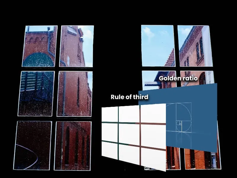
Positioning the image at the center or along lines that follow the natural flow of the viewer’s gaze (e.g., the “rule of thirds” in photography).
A glossily colored in a muted background—a blue button on a black-and-white webpage.
Adding intricate details to one side of the design while keeping the rest simple.
Without a focal point, an artwork makes no sense. An artwork with no guidance for the viewer through the content deliberately and intuitively is invalid.
Rhythm/Repetition
Repetition is the practice in a design when a single object or other design elements such as colors, lines, shapes, and patterns repeat with variations. Rhythm is the repetition and variation of these design elements in a deliberate and structured manner.
There are five types of rhythm in art: random rhythm, flowing rhythm, regular rhythm, alternating rhythm, and progressive rhythm.
Random Rhythm: The elements in a design are arranged impulsively or randomly. Jackson Pollock’s Drip Paintings, “Number 1A, 1948” is an example.
Flowing Rhythm: The elements in a design are structured in a manner that produces a sense of fluidity or continuity and movement or motion. The portraits of Vincent van Gogh are a solid example.
Regular Rhythm: The elements in a design are organized in an orderly and systemic way to create a sense of harmony and balance in a design. An example is found in the artwork of a Dutch painter and art theoretician, Pieter Cornelis Mondrian.
Alternating Rhythm: The elements in a design are structured in a pattern when two different repeating elements alternate back and forth. The chessboard squares where repeating black squares alternate with repeating white squares.
Progressive Rhythm: The elements in a design are organized in a sequence that implies a steady decrease and increase in texture color and size. Jack-in-the-Pulpit No. IV by Georgia O’Keeffe is a great example.
Proportion/Scale
Don’t get confused with contrast which is about differences between elements to make them stand out while the scale is a relative size of a design element as compared to another design element. A single element in an artwork can have no scale until and unless it is seen in comparison with others when exists within the design.
Proportion is an element of design that relates to the relative size of the components contained in an object while scale is about the size of an object or element compared to another object or the overall design.
Principles of Design Vs Elements of design
Elements of design are the elementary units used to create a visual design. Examples of elements of design are texture, shape, line, form, color, value, and space. Elements of design give proper structure to the artwork while carrying out meaning and evoking emotions.
On the other hand, principles of design are guiding principles or rules that oversee how the elements of design are used in an artwork. Examples of principles of design are movement, emphasis, unity, balance, proportion, contrast, and rhythm.
Principles of design help to produce coherence, harmony, and visual interest in artwork by rightfully placing, organizing, and manipulating the elements of design.
Line, shape, color, value, texture, space, form, size, typography, balance, unity/harmony, contrast, emphasis/focal point, rhythm/repetition, and proportion/scale are the basic elements of design.
Balance in a graphic design is used to add gravity and visual weight.
Conclusion
At its core, the elements of design are the building blocks you use to produce your artwork to your creativity, and convey a message visually, much like a painter needs paint.
From color, value, texture, and space to emphasis/focal point, rhythm/repetition, and proportion/scale, a visual artist consumes multiple elements and principles of design to create visually influential and impactful messages to carry out or expose his/her artwork.