How to Create a Landing Page That Actually Converts in 2026
You pay for every click. Whether it is Google Ads, Meta, or a sponsored newsletter, every visitor costs money. And if that traffic is landing on your homepage, a services page, or any page built to serve ten different purposes at once, most of that money is evaporating before the visitor has even read your headline. The fix is not a bigger ad budget. It is learning how to create a landing page with just one goal, one audience and one clear next step for the visitor to take which is also known as CTA.
This guide explains how to create a landing page from zero. It covers every element that separates it from pages that convert 2% to pages that convert at 12%.
Those who actually learn how to create a landing page correctly reduce their wasted ad spend and get more conversions.
Table of Contents
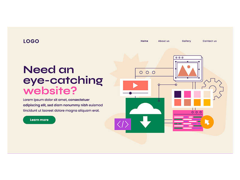
What Is a Landing Page?
A landing page is a webpage with a single goal, and that is to turn visitors into buyers. And the best way to create a landing page is to have no distractions on it to compete with that goal. It is not your homepage, not your about page. It is a general services page. And it exists for one single reason.
To take a visitor with a specific intent and turn them into a buyer, a subscriber, or make them book a call, etc. Every element on this page, from the headline to the form to the CTA button text, all sit there to point a user towards one single action, nothing else.
People including myself confused a homepage with a landing page. What makes a landing page different from any other page on your website is its focus. A homepage typically has navigation menus, multiple links, team bios, blog posts, and six different call to action all there competing for your attention.
The best way to create a landing page is to focus on one audience, one offer, and one clear CTA, one decision. That singular focus is why dedicated landing pages convert at nearly double the rate of general website pages.
Businesses that create a product landing page for a specific offer usually see better conversion rates.
Many businesses learning how to make a landing page think strong visuals are enough, while messaging and clarity are more important.
Brands that learn how to create a landing page find that talking to a specific audience typically see higher conversion rates.
Top digital marketing services build landing page funnels often improve performance by removing unnecessary distractions.

Why You Need a Landing Page
Sending paid traffic to your homepage is one of the most common mistakes, which is why businesses should create a product landing page aligned directly with the ad message. The homepage serves everyone and therefore converts no one specific.
A visitor who clicked on a Google ad searching for “affordable dental implants In Georgetown” typically ends up on a landing page full of navigation options and general clinic information. The intent between what the user was promised and what the page told is broken.
That mismatch is what is called a message mismatch, and it is the main reason why paid campaigns underperform. The best way to create a landing page is to keep the message consistent from ad to page.
Businesses with 10 to 15 dedicated landing pages generate 55% more leads than those with fewer than 10 [Source: HubSpot, cited in Hostinger, March 2026].
That is not because more pages mean more traffic. It is because more pages mean more precise targeting.
Each page speaks to a segmented audience with one offer and is engineered to convert those specific visitors better than any general page could.
If your current marketing setup sends all traffic to a single page. Then you’re probably trying to send all the possible leads into a funnel that is not made for them.
For paid advertising campaigns, create a product landing page that aligns with the exact ad message
Businesses researching how to create landing page experiences for paid campaigns often focus heavily on audience intent.
Understanding how to create a landing page campaigns more effective usually starts with better targeting.
Teams who have learned how to make landing page the right way create simple offers and CTAs that convert better.
How to Create a Landing Page: Step-by-Step Guide
Building a landing page is made by taking a series of connected decisions. And each one builds on the last. The order is important to remove friction. And getting the goal wrong makes every downstream element harder to optimize.
The best way to create a landing page is to launch quickly, test consistently, and optimize with data.
Many businesses try to skip this part. Other businesses consistently outperforming their industry benchmarks don’t focus on building the perfect page on the first try. They launch fast, learn, iterate, and improve, all done in sequence.
Businesses who have learnt how to build landing pages successfully prioritize testing over perfection.
A reliable landing page creator can help make business launch pages faster without any need to learn coding.
Companies who focus more on creating a landing page specifically for paid ad campaigns see better ROI with proper optimization.
Step 1: Define Your Goal
Before building a landing page you must fast answer one question: what do you want the visitor to do? Not two things. Not a range of possibilities. One specific action. Book a call. Download a guide. Start a free trial. Request a quote. Sign up for a webinar.
When you create a product landing page set a goal as this will give direction to each element on the page. Whether it’s the headline, the form length, the CTA text, and how much copy is needed to bridge the gap between where the visitor is at that time and where you want or what action you want them to take.

A page with no goal always tries to serve multiple purposes and struggles to make visitors convert always.
Pro tip: Before you start building any landing page, write this one sentence: “The visitor will leave this page having done one thing, and that thing is X.”
Anyone who is learning how to create a landing page should set what their conversion goal is before writing anything.
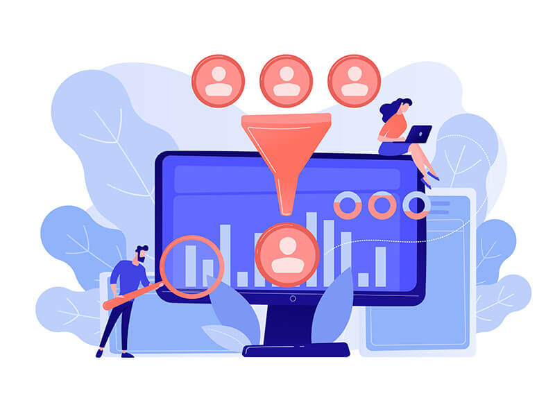
Step 2: Identify Your Target Audience
The second decision is who the page is for, specifically. Not “small business owners.” Not “people interested in health.”
The more vividly you can describe your target audience at this stage, the more precise you can create a product landing page for them. What search term did they just type? Which ad did they click? Why are they here today? Is there an objection running through their mind right now?
A landing page that is written for a specific person with one specific problem converts much better than one written for a broad audience.
Businesses exploring how to create landing pages for different audiences often improve conversions through personalized messaging.
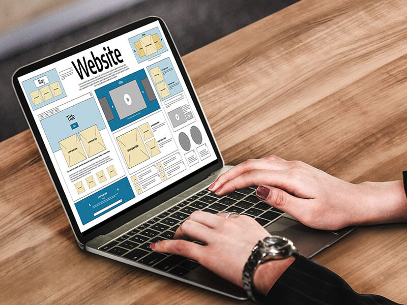
Step 3: Choose the Right Landing Page Builder
In 2026, you do not need a developer to build a simple landing page. There’re many tools that take care of the technical weights which give you time to focus on the elements that actually convert. That includes your copy, offer, and form design.
The right builder depends on your situation.
Leadpages is one of your strongest option for small businesses and solopreneurs, with unlimited traffic on all plans, a $49 starting price, includes conversion optimized templates, and a drag and drop editor that does not require prior coding knowledge.
Unbounce is ideal if you are getting enough traffic that you can benefit from using AI-powered Smart Traffic. This automatically directs traffic to the highest converting page variant without manual A/B testing. Plan starts at $99 per month.
Instapage is ideal for teams managing multiple campaigns and want 1:1 ad-to-page message matching at scale. It is a premium option and priced accordingly which and justified when personalization at that level drives measurable pipeline improvement.
Templates combined with strong copy consistently outperform expensive custom builds without proven conversion fundamentals underneath them.
Many businesses use a landing page creator to simplify testing, hosting, and page optimization.
Companies learning how to build landing pages at scale often rely on templates and structured testing workflows.
If you need help building landing pages that convert hire a professional WordPress developer. As it saves time and is done by professionals whose job is to bring conversions daily.
Step 4: Craft a Compelling Headline
Headline is one of the core elements inside a landing page. According to a study, 90% of the visitors read headlines first, and then decide if they should read the rest of the page.
That number sounds extreme until you realize how many landing pages are running headlines that say something like “Welcome to Our Services” or “Solutions for Your Business.”
Those headlines are vague and don’t answer the visitor’s questions. Which is: what is in it for me and why should I care right now?
The strongest headlines are specific, include a number, show a time frame, a measurable outcome. They use the visitor’s language instead of industry jargons wherever possible.
And they answer the core question of the user within five seconds without requiring the visitor to scroll.
“Get 40% More Leads in 30 Days Without Increasing Your Ad Budget” is a headline. “Grow Your Business Today” is a placeholder.
Businesses researching how to make a landing page more effective often start by improving headline clarity.
Step 5: Write Persuasive Copy
Another best way to create a landing page is to keep it as long as needed to convince the reader to take an action. For a low commitment offer like a free guide download, a short page with a headline three bullet points, and a form is enough.
If your offer is high value like a $3,000 service, a longer copy that builds trust, addresses objections, and stacks proof before asking for conversion is ideal.
In both cases, the copy should focus on the user’s benefit and not just features.

Not “our platform has 47 integrations” but “connect all your tools in one place and recover five hours every week.” The visitor is not reading your page to learn about your product. They are reading it to find out whether your product solves their problem. Write to that question and answer it clearly within the first paragraph.
Pages with multiple offers on one page convert lower than single-offer pages. One page, one promise, one offer, and copy that exists only to support that one conversion action.
Understanding how to make landing page copy persuasive usually comes down to focusing on benefits instead of features.
Step 6: Add Eye-Catching Visuals
Visuals on landing page should support conversion and not just exist for aesthetics. A hero image should show your product in use, a result the visitor wants to achieve, or a person who represents the target audience can make it real.
Stock photos of handshakes and abstract scenes don’t perform as well specific and relatable images that are directly connected to your offer. Video is the highest-converting visual asset available when used correctly.
Embedding a relevant video on a landing page increases conversions and helps visitors retain most of the message compared landing pages with text alone.
A product demo video, a 60-second explainer, or a short client testimonial on video placed near the CTA consistently lifts conversion without requiring a production budget. Keep visuals light in file size because every additional second of load time is a conversion killer, covered in detail in Step 8.
Businesses researching how to make landing pages more engaging often use videos and customer-focused visuals.
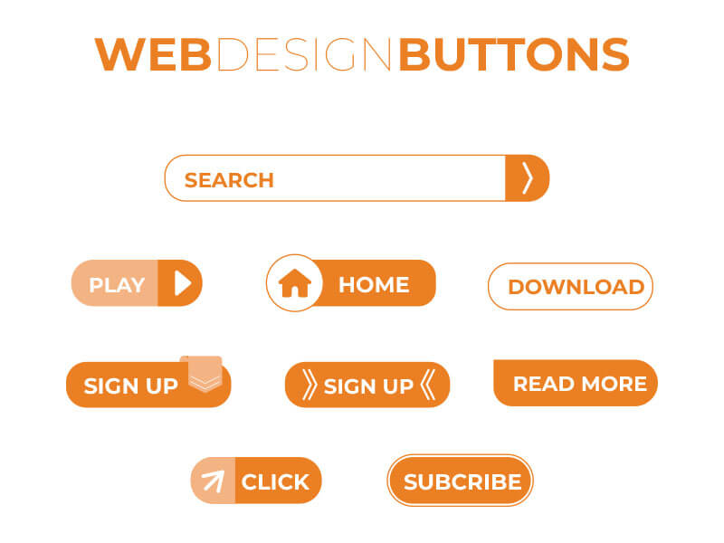
Step 7: Include a Strong Call to Action
The CTA is where the conversion happens or does not. Every page should have one primary call to action. Not two. Not a row of options. One action, repeated in multiple places on the page if the page is long, but always pointing to the same single goal.
The wording of the CTA button matters more than most marketers expect. “Submit” decreases conversions because it communicates nothing about what the visitor receives. “Get My Free Strategy Session” outperforms it because it uses first-person language, focuses on the benefit received rather than the action taken, and makes the exchange feel concrete.
A sticky-bottom CTA that follows the visitor as they scroll produces an 11% conversion lift on long-scroll pages [Source: Digital Applied, March 2026].
Companies focused on creating a landing page that converts often test CTA wording first.

Step 8: Optimize for Mobile and Speed
Mobile accounts for majority of landing page traffic in 2026, but it converts at roughly 58% of the desktop rate [Source: Digital Applied, April 2026]. That gap is not a device problem. It is friction between the first touch point and the CTA button.
Most mobile underperformance traces directly to slow load times, oversized forms, text that requires zooming, and CTA buttons too small to tap accurately. Pages loading in 1 second have 3 times higher conversion rates than pages loading in 5 seconds [Source: Google data, cited in Involve.me, March 2026].
Every additional second of load time drops conversion by 7% [Source: Net Partners Marketing, May 2026: netpartners.marketing]. Compress every image before upload. Minimize JavaScript that delays the page render.
Use a hosting environment with fast server response times. Test the page on an actual mobile device, not just a browser simulator. Google’s Core Web Vitals standard specifies that buttons and form fields should be at least 48 by 48 pixels with adequate spacing between interactive elements, because tap targets that are too small cause abandonment regardless of how compelling the offer is.
Businesses learning how to create landing pages for mobile traffic usually focus heavily on speed optimization.
Step 9: Integrate Forms or Lead Capture Elements
The form is where most landing pages bleed conversions silently. Three-field forms convert at 10.1%; nine-field forms convert at 3.6% [Source: Unbounce 2026 Conversion Benchmark Report, cited in Digital Applied].
Every additional field beyond what is strictly necessary drops conversion by 4 to 8% [Source: Net Partners Marketing, May 2026]. Reducing a form from 11 fields to 4 fields produced a 120% increase in conversions in one documented case study [Cited in Lovable.dev].
The rule is simple: ask only for what you need to take the next step. For a free guide, an email address is enough. For a sales consultation booking, name, email, and company size may be necessary.
Everything beyond that minimum is friction that will cost you leads. If you need more information to qualify leads, collect it in the follow-up sequence after the initial conversion, not on the page itself. For B2B, 3 to 4 fields is the documented sweet spot; for a eCommerce website email capture, 1 to 2 fields maximizes opt-ins [Source: Net Partners Marketing, May 2026].
A modern landing page creator often includes built-in form testing and analytics tools.
Step 10: Test and Optimize
A landing page is not finished at launch. It is finished when the data tells you it has reached its ceiling, which rarely happens on the first version. Only 1 in 8 A/B tests produces a statistically significant result [Source: VWO, cited in Hostinger].
That means most tests will not produce a clear winner, and that is normal. What matters is testing the right elements in the right order. The four elements that drive the largest share of landing page variance are the headline, the hero image, the primary CTA, and the form length.
Tests on these four produce statistically significant winners roughly 24% of the time, nearly double the overall testing rate [Source: Digital Applied, April 2026]. Do not start by testing button colors or footnote copy. Start with the headline and run that test until you have statistical significance. Then move to the CTA. Then the form.
Systematic testing of high-impact elements produces an average 49% conversion lift over time [Source: TrueFuture Media].
Use Google Analytics 4 to track conversion events and Google Optimize or your landing page builder’s native testing tool to run structured experiments. Heatmapping tools like Hotjar show you exactly where visitors click and how far they scroll, which reveals friction points that raw conversion data alone cannot explain.
Businesses learning how to create a landing page successfully rely heavily on testing and iteration.

Common Mistakes to Avoid in Creating a Landing Page
The most expensive landing page mistakes happen before a single visitor arrives.
- Sending paid traffic to a homepage instead of a dedicated page is the most common: 77% of landing pages are actually homepages, and the conversion penalty is significant.
- Keeping navigation menus on the page gives visitors exits before they convert.
- Multiple CTAs reduce conversion by 15 to 30% compared to a single focused action.
- Ignoring page speed, writing headlines that talk about the company instead of the customer, and using long forms that ask for more than the first contact requires are patterns that consistently suppress results.
Every mistake traces back to the same root cause: the page is trying to serve too many purposes at once.
A landing page built for one person, one offer, and one action will outperform a complicated page almost every time.
Tips to Make a Landing Page Convert Better
The highest-leverage improvements follow a clear priority order.
- Get page speed under 2 seconds first because it requires no design changes and delivers immediate gains.
- Cut your form to 3 fields maximum.
- Place one specific testimonial with a real name and a measurable result directly beside your CTA.
- Social proof positioned near the conversion point lifts results by 18 to 32% consistently.
- Rewrite your headline before testing anything else, because it drives more conversion variance than any other single element.
- Remove navigation links entirely.
- Add social proof within the first viewport since 64% of mobile visitors never scroll past it.
Use first-person, benefit-focused CTA text instead of generic labels.
These five changes, applied in order, produce measurable improvement within weeks without touching your ad spend.
Frequently Asked Questions
Carrd, Leadpages, or even Mailchimp give you a standalone page with its own URL. You don’t need hosting or WordPress. All you need is to pick a template, write your offer, connect a form, and hit publish. It creates simple pages in less than an hour.
Yes, and it's genuinely fast. Tools like Framer AI or Durable build the structure from a prompt. But the AI won't know your offer, your customer, or what makes you different. That part still needs you.
Technically yes. It is free, doesn’t require coding, and can go live in minutes. But it builds information pages not conversion pages. So, if you want leads or sales, Google Sites will let you down.
Webflow, Carrd, or Framer. All of these tools offer drag and drop tools and all can build publishable pages. Pick one, grab a template close to your goal, and swap in your copy. The tool builds the page. Your words do the selling.
With a no-code tool and a clear offer it takes about 2 to 4 hours. It can build fast, but the copy is where most people get stuck, and that is actually what does most of the selling on a page.
Conclusion
A landing page is the single highest-leverage asset in your digital marketing stack, and building one correctly is not as complicated as most articles make it.
Ready to stop paying for clicks that go nowhere?
Book a free strategy session and we will show you exactly what your page needs to convert better, starting this week. Click here to book a free strategy session.
Mastering how to create a landing page takes ongoing optimization, testing, and audience-focused messaging.
ITVerticals Services

50+ Easy Animation Ideas from Beginners to Experts
Adam Romy
June 15, 2026
Proven Local SEO Strategies That Work in 2026
Adam Romy
June 8, 2026
How to Create a Landing Page That Actually Converts in 2026
Adam Romy
June 1, 2026
Top 10 SEM/PPC Strategies for Better ROI in 2026
Adam Romy
May 25, 2026
Successful Email Marketing Strategies That Drive Results In 2026
Adam Romy
June 22, 2026
50+ Easy Animation Ideas from Beginners to Experts
Adam Romy
June 15, 2026
Proven Local SEO Strategies That Work in 2026
Adam Romy
June 8, 2026
How to Create a Landing Page That Actually Converts in 2026
Adam Romy
June 1, 2026
Top 10 SEM/PPC Strategies for Better ROI in 2026
Adam Romy
May 25, 2026
